veeral does data
Visualizing Time Series with Animated Plots
10 April, 2020Introduction
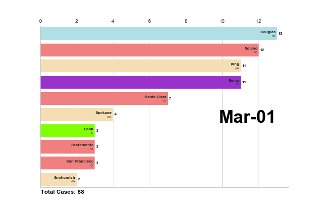
I've been working alongside a team of people to collect and analyze data relating to the impact and response to COVID-19 over the past few weeks. When trying to convey the changes in collected responses over time, I've found it especially useful to use animated plots like this time-series animated bar plot showing the county-specific spread of the the virus over the last few months:
This post is about how to create such plots that convey trends in data over time in an accessible and informative manner.
Prerequisites
You'll need a bit of rudimentary Python knowledge, and the following packages:
- Pandas
- Numpy
- Matplotlib
- Datetime
That's it! Make sure you have those packages installed and imported and let's get started!
Collect and Organize your Data
Pandas has a tool to import data from just about any common data source into a Dataframe in Python. The package can read data from a CSV file, JSON file, TXT file, Excel file, HTML file, etc. and organize it for you into your Dataframe. Link here for specific documentation. Your dataframe should look something like this:

Dates
Identify your date variable.
Animated plots are particularly useful in understand the changes in data over a certain time period. Define your time period, and reclassify the dates in your dataset as Python Datetime variables:
my_df['date'] = pd.to_datetime(my_df['date'])Choose Graph Type
What type of graph best visualizes your data? Bar graphs often display categorical independent variables and numeric dependent variables well. Scatter and line plots can be useful for numeric x and y variables.
Build your Update Function
The update function will iterate through your chosen dates, and create a static plot image at that date. Through each iteration, redefine the dataset to filter for rows at that date. Plot the data, and then move on to the next date in your iteration. Your update function will look like:
def update(df, date):
    # Filters dataframe to rows at the date
    data = df[df['date']]

    # Assigns filtered data to x,y variables
    x = data['state']
    y = data['cases']

    # Creates matplotlib figure and axes to plot graph
    fig, ax = matplotlib.pyplot.subplots(1,1,figsize=(9, 6))
    ax.bar(x, y)

    # Adds figure title as the date of that iteration
    fig.suptitle(date)
Create your Animation
To create your animation, I suggest you use the FuncAnimation function from Matlplotlib's animation package. You will need to set the following parameters:
- fig: figure object of your graph
- func: your update function
- frames: a list for your update function to iterate through. In this case, a list your dates sorted chronologically
- interval: Delay between frames in milliseconds.
- repeat: Boolean that controls whether or not you animation repeats from the beginning after iterating through all dates
- repeat_delay: If the animation in repeated, adds a delay in milliseconds before repeating the animation.
You can save your animation as a .mov, .mp4, or .gif file in your local path. Your animation function should look something like:
anim = matplotlib.animation.FuncAnimation(
    fig=fig,
    func=update,
    frames=date_list,
    interval=1000,
    repeat=True,
    repeat_delay=2000
)

anim.save(local_path+'myanim.gif')